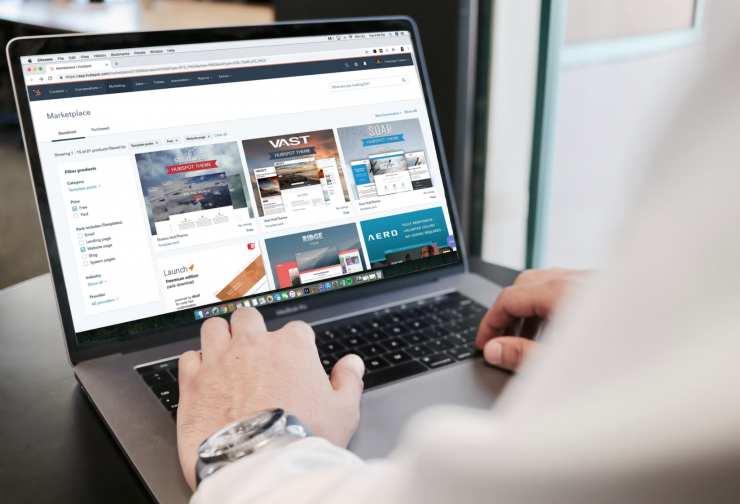
When planning an event, it’s important to create a user-friendly website that is easy to navigate. Not only will this make hosting and managing the event easier for you, but it will also encourage more attendees to register.
Events websites are designed around the flow and engagement of visitors. Additionally, it should be easy to read and find the information attendees need. The following tips will help you create an event website that is easy to use and perfect for your event.
Easy to Navigate Website
One of the most important aspects of an event website is how easy it is to navigate. Visitors should be able to find what they are looking for quickly and easily.
One way to make a website easy to navigate is to use simple, straightforward text and graphics. You should also keep the layout clean and simple so that visitors can easily see all the information on the page.
By grouping related information on one page, you can also make it easier for visitors to find information. Visitors will be able to find what they are looking for more quickly and easily this way.
Finally, make sure your website is updated regularly with the latest information. This will keep visitors aware of upcoming events and changes that may affect their plans.
Quick and Pithy Information
Creating a user-friendly event website can be a challenge, but it’s important to make sure that your visitors can find everything they need quickly and easily. Try to Keep information concise and to the point.
Keep all important information on the main event page or on one of the event overview pages. If there is information that is specific to a certain activity or venue, make sure to include a link on the main event page for that content.
Use clear and concise language when describing your events. Make it easy for people to understand what you have to offer by using simple, easy-to-understand wording.
Provide helpful resources, such as FAQs and videos, on the event website. This will help your web visitors feel confident about attending your events and will help them get the most out of their experience.
A few more tips
When designing your event website, it is important to keep the user in mind. Here are some tips for building a user-friendly website:
1. Use Clear Graphics and Layout: Make sure all graphics and layout are easy to understand and use. This will help users find what they are looking for quickly and make navigation easier.
2. Use Modern Design Principles: Try to use modern design principles when creating your website. This will make your event appear more up-to-date and professional.
3. Keep Content Short and Concise: Make sure all content is concise and easy to understand. This will help users find what they are looking for quickly and reduce the amount of scrolling required.
4. Give Users the ability to Register For Your Event Right From Your Website: If you have an event that requires registration, make it easy for users to do so by including a registration form on your website. This will keep users informed and motivated to attend your event.


